
Designed to Stand Out
The Packaging
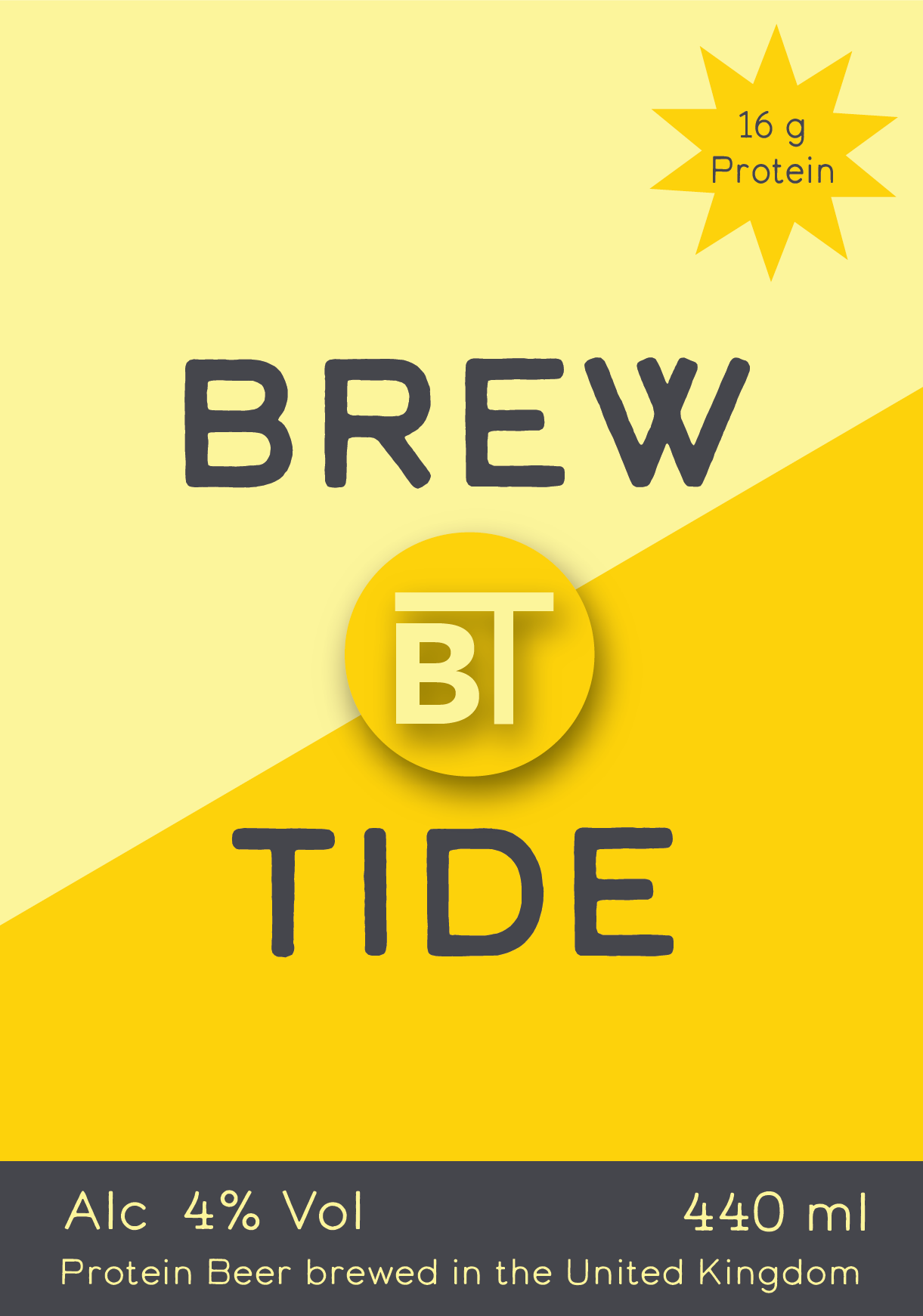
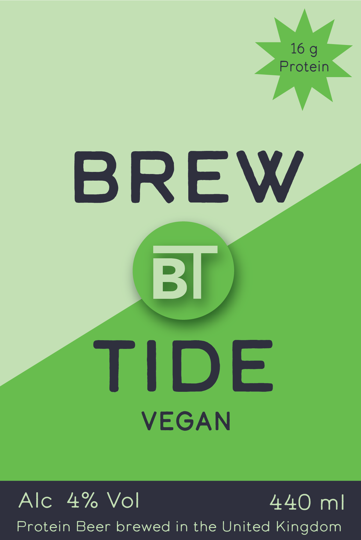
Every label is designed to reflect the brand that's inside the can. Bold. Precise. Defiant. Brewtide packaging is built to stand out on a shelf and tell a story before you've even opened it.
Colour-Coded Identity
Brewtide uses a bold colour-coding system across its range. Each variant has its own distinct palette - making it instantly recognisable whether you're grabbing a can from the fridge or spotting it across the bar.
The wrap-around labels (20.3 cm × 8.9 cm) and neck labels carry crisp, graphic typography and a minimal layout that puts the brand first. No clutter. Just confidence.
Brand Colour Palette
Every colour in the Brewtide palette is intentional. From the bold greens of the Vegan range to the golden yellows of the Original - the palette is designed to communicate energy, precision, and identity at a glance.
White
#ffffff
Light Yellow
#fef39b
Bright Yellow
#fde756
Golden Yellow
#ffd107
Dark
#2f293d
Light Green
#c3e1b4
Bright Green
#67b945
Dark Green
#2d7a48
Transparent by Design
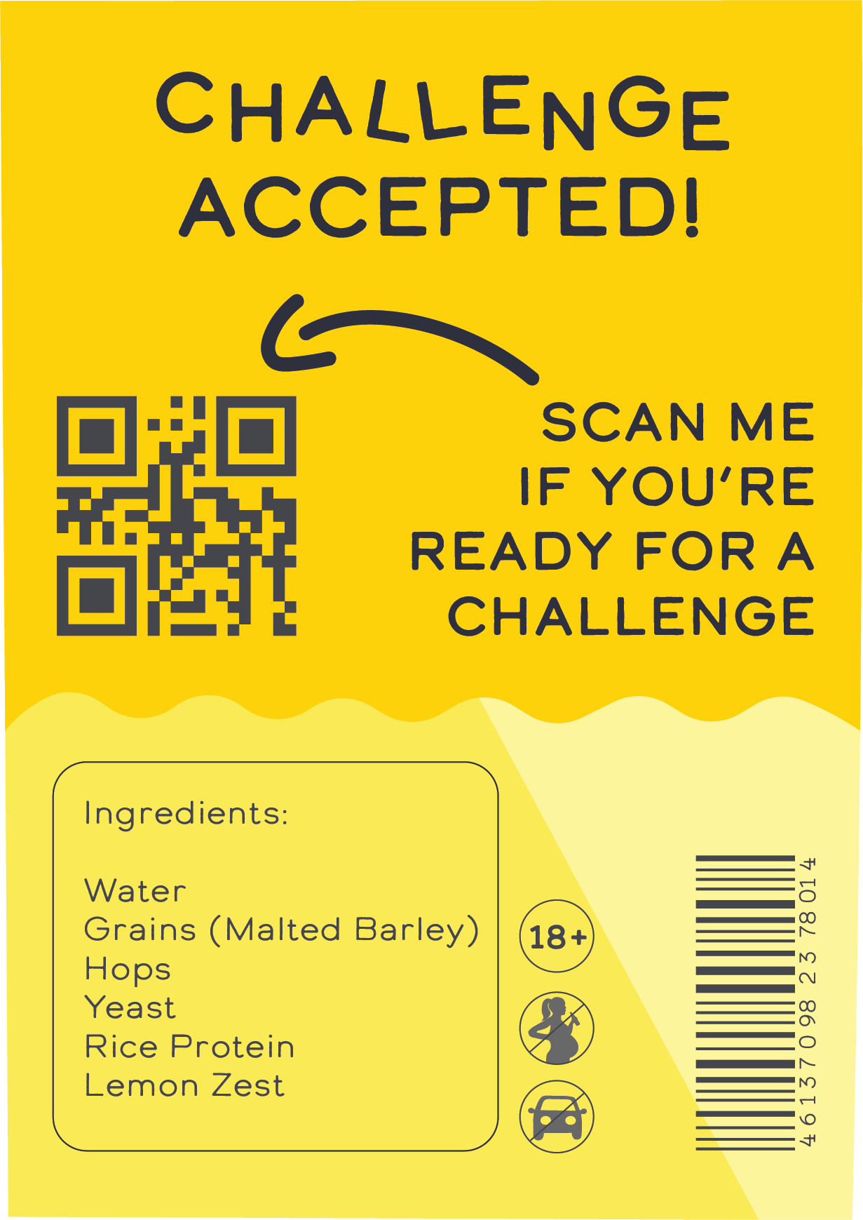
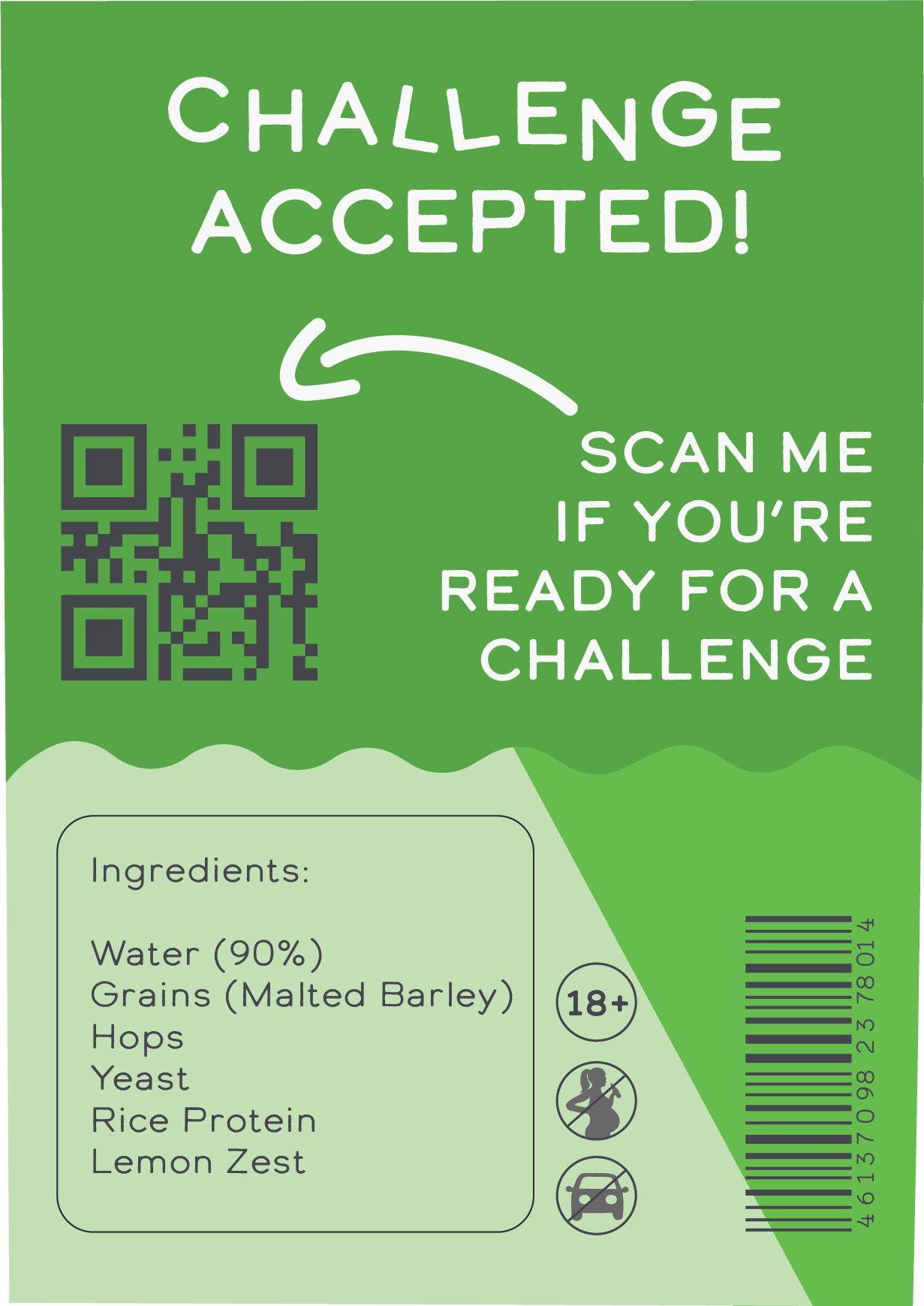
The back labels carry full nutritional information - because we have nothing to hide. Protein content is front and centre. There are no small print surprises or misleading serving sizes.
Every label is printed with precision on wrap-around format to ensure the key information is visible no matter how you pick up the can or bottle.
Two Formats. One Standard.
Whether you're heading to the gym, the bar, or the park - Brewtide comes in the format that fits your life.
The Can
Lightweight, portable, and perfectly chilled. The can is Brewtide's everyday companion - for wherever your day takes you.
The Bottle
Same formula, elevated presentation. The glass bottle is Brewtide dressed up for the occasions that deserve it.
Designed for the Shelf. Built for the Story.
Brewtide packaging is more than a label - it's the first chapter of the brand experience. Pick one up and see for yourself.